Some symbols are created simply to identify a company, while others are designed to carry an idea much bigger than the company itself. The BabaTap symbol represents a simple but powerful belief: aging should never mean losing independence, dignity, connection, or the freedom to live life on your own terms. At first glance, the symbol is intentionally simple, a warm orange circle surrounding a flowing white line that forms a distinctive “B.” Behind that simplicity, however, is the story of what BabaTap wants to build: a community where older adults can continue living their lives with greater confidence, connection, and independence.
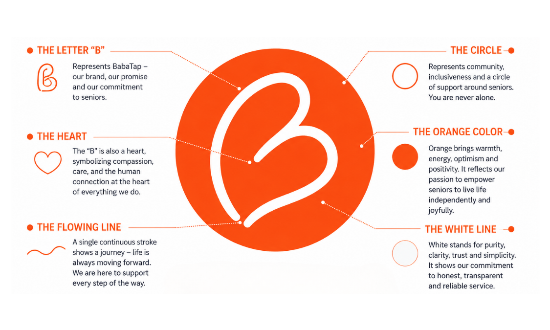
The “B” at the center represents BabaTap, but its shape carries meaning beyond the name. Its flowing form can also be seen as a heart, reflecting the human connection at the center of the BabaTap experience. BabaTap is built around everyday acts that can make a meaningful difference in someone’s life: spending time with an older adult, helping with groceries or errands, preparing a simple meal, accompanying someone to an appointment, going for a walk together, providing technology assistance, visiting someone in the hospital, or simply being present when companionship matters. These actions may seem small individually, but together they can help preserve something enormously important—the ability of older adults to remain connected to their communities and continue living life on their own terms.
The hand-drawn quality of the BabaTap “B” reinforces this human character. It is not constructed from rigid lines or perfectly symmetrical geometry because BabaTap is not intended to feel institutional or mechanical. Technology may help connect older adults, families, communities, and BabaTap Pros, but technology is only the bridge; the experience itself remains fundamentally human. The continuous white stroke suggests movement, flexibility, and a personal touch, reminding us that every person has a different story, every family has different circumstances, and every aging journey is unique.
The flowing line can also be interpreted as a path through life. Aging is not a destination where independence suddenly ends; it is a continuing journey in which needs, circumstances, relationships, and abilities may change over time. BabaTap’s purpose is not to determine how someone should live as they grow older, but to help create the support around them that allows them to continue making those decisions for themselves. This philosophy is captured in the BabaTap vision: Age Independently™. Independence does not necessarily mean doing everything alone. It means maintaining choice, control, dignity, and the ability to decide how you want to live.
Surrounding the central “B” is a circle, one of the simplest and most universal shapes. Within the BabaTap identity, the circle represents community, continuity, connection, and belonging. It symbolizes the network that can exist around an older adult—family members, neighbors, BabaTap Pros, local organizations, and community services working together when support is needed. The circle surrounds without overpowering the person at its center, reflecting an important BabaTap principle: support should strengthen independence rather than replace it. The goal is not to take control of someone’s life, but to make it easier for that person to continue controlling their own life.
The most immediately recognizable element of the identity is the BabaTap orange. Orange communicates warmth, energy, optimism, friendliness, and action. This choice reflects the way BabaTap wants society to think about aging. Older adulthood is often represented through muted colors, clinical imagery, or messages focused primarily on limitation, illness, and dependency. BabaTap chooses a different visual language because we believe aging should also be associated with possibility, participation, relationships, movement, and continued purpose. There are still places to go, people to meet, meals to share, conversations to enjoy, things to learn, stories to tell, communities to participate in, and decisions to make. The bright orange therefore becomes more than a brand color; it represents the energy of a life that continues to move forward.
Against the orange background, the white line creates clarity, openness, and simplicity. The contrast makes the symbol immediately recognizable while keeping the identity approachable and modern. There are no complicated illustrations and no imagery that defines older adults by illness or physical limitations. Instead, BabaTap uses a simple circle and a flowing, heart-like “B” to communicate something more positive and universal. This simplicity also reflects the experience BabaTap aims to create. When a family needs companionship for a parent, assistance with errands, help around the home, a hospital companion, transportation support, or simply another trusted person nearby, accessing support should not become another complicated burden. Technology should make human support easier to reach while allowing the relationship itself to remain personal.
Even the name BabaTap brings together these two sides of the vision. “Baba” feels warm, familiar, personal, and human, while “Tap” represents accessibility and connection in a modern world—the idea that support can become easier to reach through technology. The BabaTap symbol visually brings those concepts together. Its hand-drawn character reminds us that behind every booking, every profile, and every interaction is a real person. Its clean circular form allows the identity to work naturally in a digital environment. Its orange background gives the brand energy and confidence, while its heart-like “B” keeps human connection at the center of everything BabaTap represents.
As BabaTap expands into more cities and communities, the symbol is intended to carry the same meaning wherever it appears. For an older adult, it should represent possibility, independence, and connection. For a family, it should represent accessible support and greater peace of mind. For a BabaTap Pro, wearing the symbol should represent responsibility, trust, and pride in helping someone remain active and connected. For community organizations and partners, it should represent collaboration around a shared purpose. Over time, BabaTap’s ambition is for the symbol to become associated with a broader movement toward changing how society thinks about and supports aging.
At the heart of that movement is a different understanding of independence. BabaTap is not built around the idea that older adults should become dependent on a system. It is built around the belief that we can create better systems around people so they can remain independent for longer. Sometimes that support may be practical, sometimes social, and sometimes as simple as having another person available at the right moment. Whatever form it takes, the purpose remains the same: to give older adults more opportunities to continue living according to their own choices.
That is ultimately what every element of the BabaTap symbol represents. The circle is the community around us. The orange represents warmth, optimism, and the energy to keep moving forward. The continuous white line represents life’s journey and the flexibility needed along the way. The heart-like shape represents human connection, and the “B” represents BabaTap’s commitment to bringing all of these ideas together. The result is more than a logo. It is a visual expression of a future where growing older does not mean stepping away from life, but continuing forward with dignity, connection, choice, and support.
BabaTap.
Bài viết liên quan: