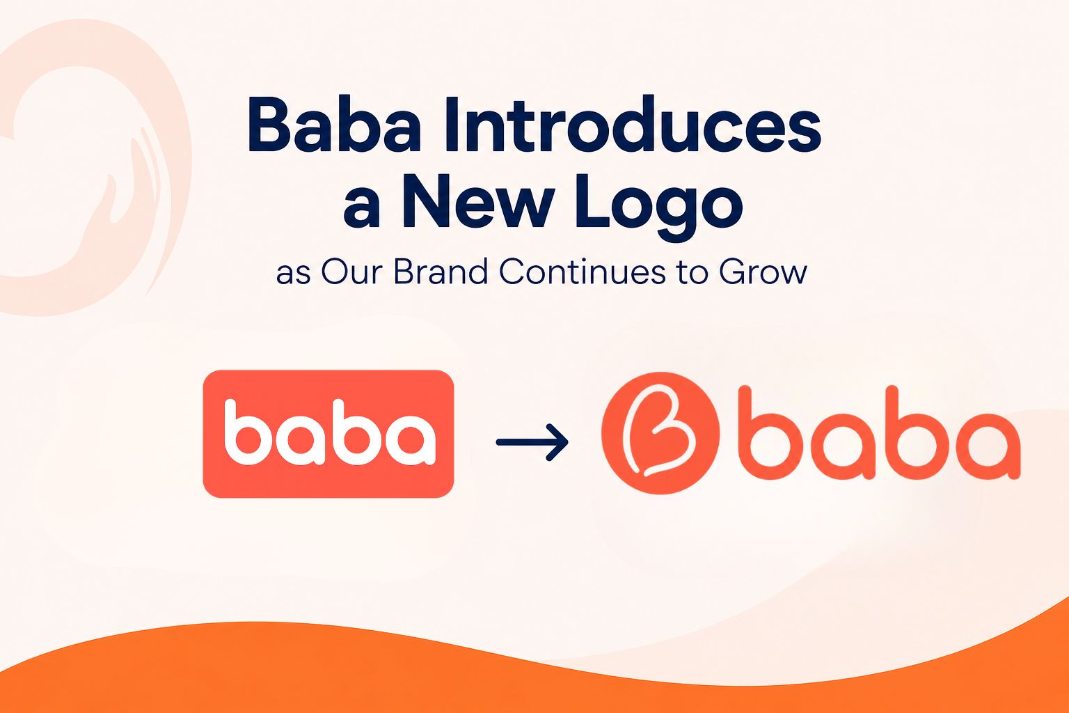
Effective August 12, 2026, BabaTap is officially introducing a new logo as part of the continued development of our brand and our commitment to building a trusted, recognizable, and meaningful senior companion service.
The new BabaTap logo represents an important step forward for our organization. As BabaTap continues to expand its services and strengthen its presence in communities, we believe our visual identity should clearly communicate what the brand stands for: companionship, kindness, human connection, dignity, and support for older adults.
At the center of the new identity is a simple heart-inspired symbol designed to express care and connection. Within the symbol, the flowing shape also suggests a gentle hand embracing and supporting another person. Together, these elements reflect the relationship we want BabaTap to create between seniors, families, BabaTap Pros, and the communities we serve.
Our goal was to create an identity that feels warm without being overly complicated, professional without feeling institutional, and modern while remaining approachable to people of all generations. Senior support is deeply personal. Behind every booking is a person, a family, a conversation, a routine, or a moment when someone may simply need another person to be there. We wanted the new BabaTap logo to communicate that human element in the simplest possible way.
The heart represents compassion. The embracing form represents support. The circular movement within the design communicates connection and continuity. Together with the BabaTap name, these elements create a visual identity that we believe can grow with the organization for many years.
While our logo is changing, the purpose behind BabaTap remains the same.
BabaTap is focused on providing non-medical companion services that help older adults remain connected, supported, and independent in their everyday lives. Aging can bring changes to routines, mobility, social connections, and family circumstances. Not every senior needs medical care, and not every form of assistance needs to come from a healthcare professional. Sometimes what makes the greatest difference is having a dependable person available to accompany, assist, listen, communicate, or simply spend meaningful time together.
This is the space BabaTap was created to serve.
Through the BabaTap network, we are working to make senior companion services more accessible and flexible while creating a consistent standard of trust across the communities in which we operate. Whether someone needs companionship, assistance with everyday activities, transportation support, help with errands, a hospital companion, or simply another human connection during the day, BabaTap is being built around the idea that practical assistance should always be delivered with dignity and respect.
The new visual identity reflects this philosophy.
We intentionally chose a clean and uncomplicated design because we want BabaTap to be easy to recognize wherever people encounter us. Over time, the new symbol will appear across BabaTap websites, local service pages, communications, digital platforms, partner materials, uniforms, identification materials, community initiatives, and other parts of the BabaTap network.
Customers and partners may temporarily see both the previous and new visual identities during the transition. Beginning August 12, 2026, we will gradually update BabaTap materials and digital properties with the new logo. This transition will take place progressively so that existing services and operations can continue without disruption.
The introduction of the new logo also reflects a broader stage in BabaTap’s development. What began as an idea centered on practical non-medical support for seniors is becoming a larger service network designed around local communities. As that network grows, having a clear and consistent identity becomes increasingly important.
We want someone who sees the BabaTap symbol in one community to recognize the same values when they encounter BabaTap somewhere else. The experience should feel local and personal while being supported by a broader identity and common service philosophy.
For families, we want BabaTap to represent reassurance. For seniors, we want it to represent companionship, independence, and respect. For BabaTap Pros, we want it to represent the responsibility that comes with being invited into another person’s daily life. For communities, we want BabaTap to become a familiar symbol of people helping people.
Our new logo is therefore more than a design update. It is a visual expression of the organization we are working to build.
We also believe the simplicity of the new identity gives BabaTap room to grow. Senior needs are diverse, and the ways families support aging loved ones continue to evolve. BabaTap must be able to evolve as well while remaining grounded in its core purpose. A strong identity should not define the brand by one individual service. Instead, it should represent the relationship that connects everything we do.
That relationship is human connection.
Technology can make services easier to discover, coordinate, and manage, but technology cannot replace companionship. A platform can facilitate a booking, but the meaningful part begins when one person arrives to support another. A system can organize information, but trust is created through reliability, communication, patience, and respect.
The new BabaTap symbol is intended to remind us of that distinction.
As we introduce this new identity, we are grateful to the seniors, families, BabaTap Pros, partners, and communities who continue to interact with and contribute to the development of BabaTap. Every conversation, booking, suggestion, and experience helps us understand how we can build a better senior companion service.
August 12, 2026 marks a new visual chapter for BabaTap, but it also reinforces a very simple commitment.
We are building BabaTap around people.
As our network grows, our services evolve, and our new logo becomes more familiar, the heart of BabaTap will remain unchanged: helping older adults feel supported, respected, connected, and less alone.
A new logo. The same purpose. A stronger BabaTap for the future.
Bài viết liên quan: